 العربية
10 Simple Web Design Tweaks to Double Your Conversion Rate (CRO)
You’ve built a beautiful website. The traffic is flowing in. But there’s a problem: nobody is buying.
It’s a frustrating scenario faced by many business owners. You see the numbers on Google Analytics, but they aren’t translating into revenue. The solution isn’t necessarily to spend more on ads to get more visitors; the solution is to get more out of the visitors you already have. This is where Conversion Rate Optimization (CRO) comes in.
CRO is the art and science of guiding your visitors toward a specific goal, whether that’s making a purchase, signing up for a newsletter, or booking a demo.
You don’t need a complete site overhaul to see results. Here are 10 simple, high-impact design tweaks you can implement today to boost your conversions.
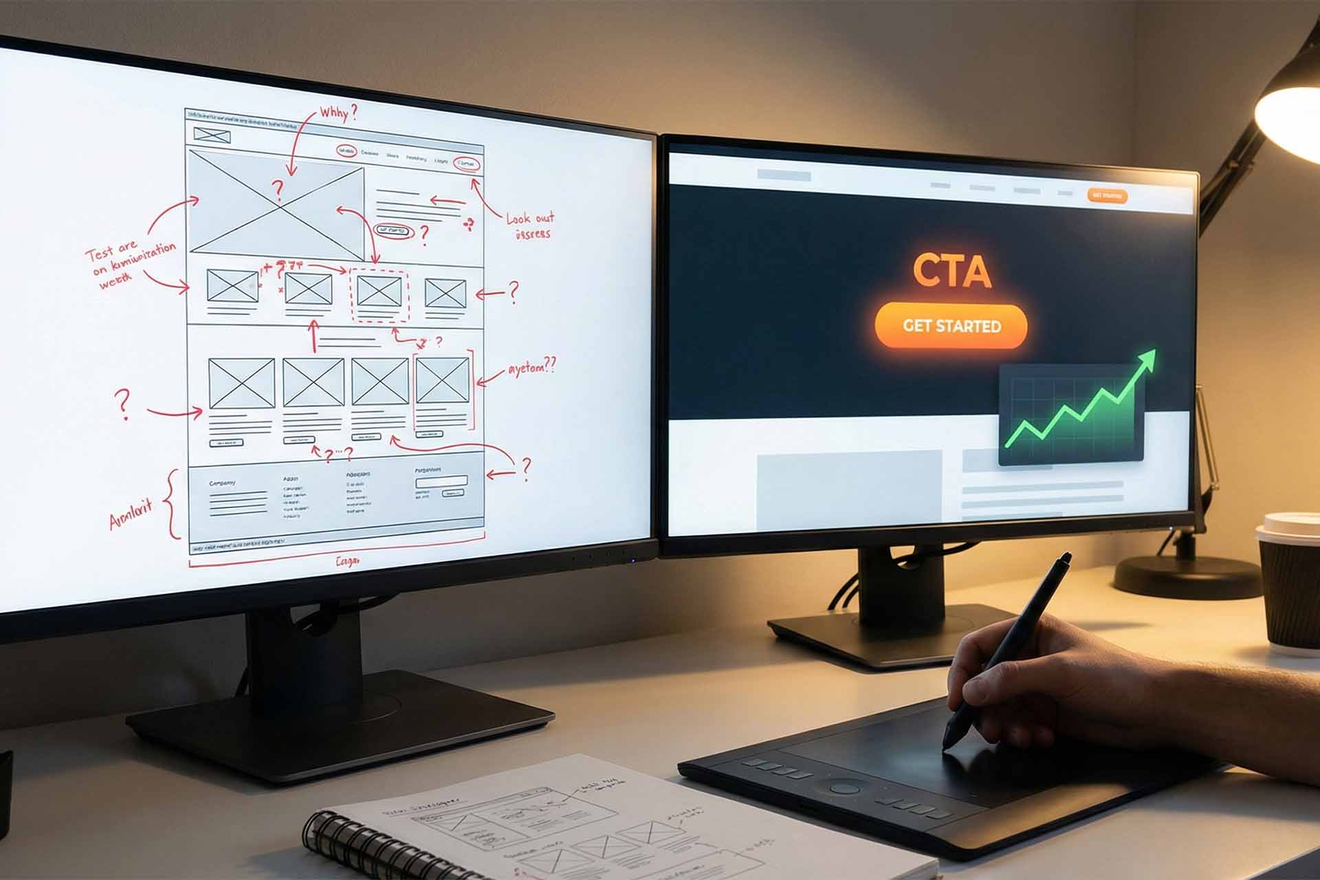
1. Make Your CTA Button Impossible to Miss
Your Call-to-Action (CTA) button—the one that says “Buy Now” or “Sign Up”—is the gateway to your revenue. If a user has to hunt for it, you’ve already lost them.
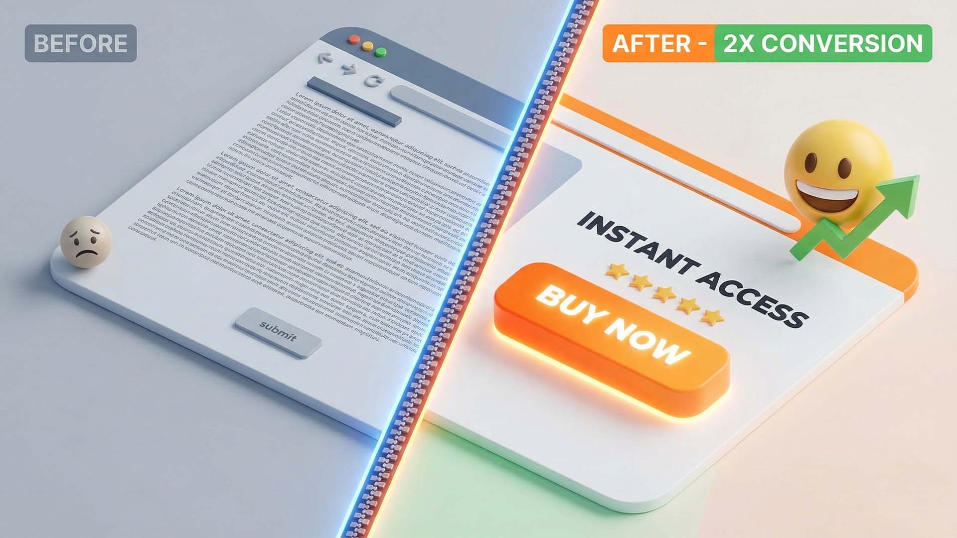
- The Tweak: Use high-contrast colors. If your site is blue, make the button orange or red. It needs to pop off the screen.
- Visualizing the Change:
- Before: A ghost button (transparent with a thin border) that blends into the background image.
- After: A solid, vibrant button with a subtle drop shadow that screams “Click me.”
2. Simplify Your Forms (Less Friction = More Leads)
Every extra field in a form is a hurdle your user has to jump over. If you ask for too much, they will simply leave.
- The Tweak: Cut the fat. Ask only for what is absolutely necessary (usually just a name and email).
- Pro Tip: If you absolutely need more data, use a multi-step form (e.g., Step 1: Contact Info -> Step 2: Project Details). This feels less overwhelming.
3. Write Headlines That Hook (Value Proposition)
Users decide within 5 seconds whether to stay or leave. Your headline shouldn’t be clever or abstract; it should clearly state what’s in it for them.
- The Tweak: Focus on the benefit, not the feature.
- Example: instead of “Innovative Cloud Solutions,” try “Cut Your IT Costs by 30% with Our Cloud Tools.”
4. Place Social Proof Where It Matters
Trust is the currency of the web. Testimonials are great, but they shouldn’t be buried on a separate “Reviews” page.
- The Tweak: Place star ratings and short testimonials directly near “friction points”—like right under the “Add to Cart” button. This reassures the user at the exact moment of hesitation.
5. Speed is King: Optimize Load Times
In the mobile era, patience is non-existent. A one-second delay in page load can result in a 7% reduction in conversions.
- The Tweak: Compress your images and use a fast hosting provider. Aim for a load time of under 3 seconds to keep your conversion rate optimization efforts on track.
6. Leverage the “Fear Of Missing Out” (FOMO)
Urgency is a powerful psychological trigger. It pushes the procrastinating visitor to take action now.
- The Tweak: Add authentic scarcity elements. Use phrases like “Only 3 items left in stock” or a countdown timer for a limited-time offer.
- Note: Always be honest. Fake countdowns destroy trust.
7. Design for Thumbs (Mobile Optimization)
With mobile traffic often surpassing desktop, your site must be “thumb-friendly.”
- The Tweak: Ensure buttons are large enough to be tapped easily without zooming in. Increase spacing between clickable elements to prevent “fat finger” errors.
8. Use Authentic, High-Quality Imagery
Generic stock photos of people in suits shaking hands are conversion killers. They look fake, so users assume your business is fake.
- The Tweak: Use real photos of your team, your product in action, or your actual office. Humanize your brand. A photo of a person looking toward the CTA button can subconsciously direct the user’s eye there.
9. Remove Distractions on Landing Pages
If you are running an ad to a specific landing page, your goal is one thing: conversion.
- The Tweak: Remove the main navigation menu and footer links. Don’t give them 10 places to click; give them one path to follow.

10. Don’t Guess—Test (A/B Testing)
What works for Amazon might not work for you. The only way to know for sure is data.
- The Tweak: Use tools like Google Optimize to run A/B tests. Try two different headlines or two different button colors. Let the data decide the winner.
The Bottom Line
Improving your conversion rate doesn’t require magic or a million-dollar budget. It requires empathy for the user and a willingness to remove friction. Start by applying just one of these tips today—perhaps changing that CTA color—and watch how your metrics begin to climb.


This reads like a checklist I can actually use, not theory. Changing one thing at a time feels manageable—and measurable—which is exactly how CRO should be approached.
The imagery advice resonated with me. We replaced generic stock photos with real product shots and customer photos, and engagement improved almost immediately. People can smell fake visuals a mile away.
The emphasis on empathy is a nice touch. CRO isn’t manipulation—it’s understanding hesitation and removing friction. That mindset shift alone can change how you design pages.
I like that A/B testing is framed as learning, not guessing. Too many people copy what big brands do instead of testing what works for their own audience.
Removing navigation on landing pages felt scary the first time we tried it—but it worked. Fewer exits, more focus. This article explains why that works without overcomplicating it.
The headline advice is solid. Clear value beats clever wording every time. We tested something similar and the “less creative” headline actually outperformed the flashy one by a wide margin.
Designing for thumbs should honestly be its own article. Desktop-first thinking still sneaks into so many sites, even when analytics clearly show mobile dominates.
I appreciate the honesty around FOMO. Too many sites abuse fake countdowns, and it completely breaks trust. Real scarcity works—but only if it’s real.
The section on social proof placement is spot on. We moved testimonials closer to the pricing table and saw fewer drop-offs. It’s interesting how timing matters just as much as the testimonial itself.
The reminder about speed affecting conversions is underrated. Everyone talks about aesthetics, but load time is usually the silent killer. That 7% stat alone is enough to make people rethink oversized images.
I like how this article focuses on small, practical changes instead of “redesign everything.” Especially the part about simplifying forms—asking for less upfront has made a noticeable difference for us when booking demos.