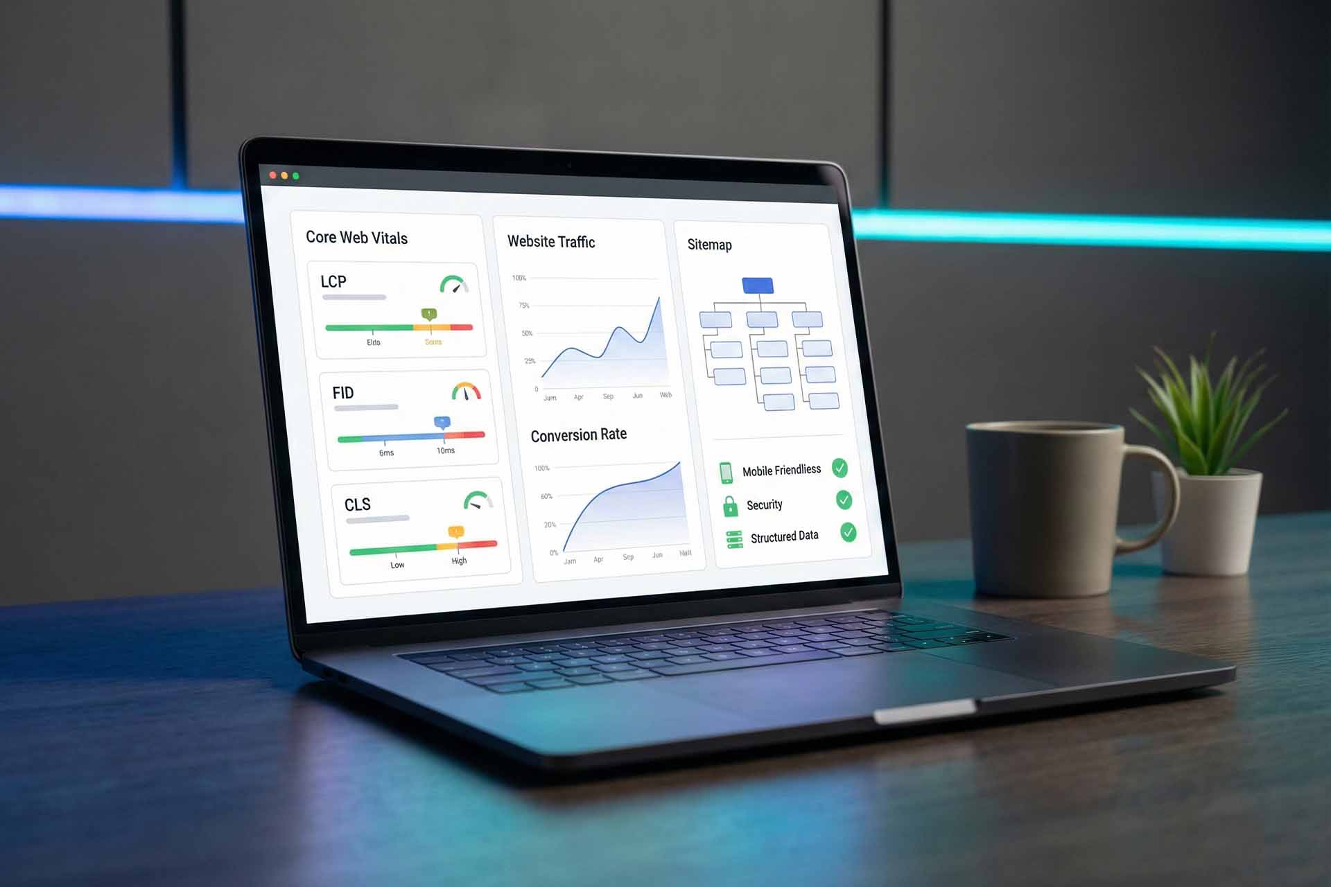
Data Visualization Storytelling: Turning Numbers into Emotion
Data Visualization Storytelling: Turning Numbers into Emotion
By Loop Media Team
Data visualization is not about pretty charts — it’s about turning data into meaning. When combined with narrative and visual design, numbers become stories that connect with people, change perceptions, and drive smarter decisions.
Why Data Visualization Changes How We Understand
- It simplifies complex phenomena into clear, visual patterns.
- It highlights what truly matters — anomalies, trends, and contrasts.
- It supports decision-making by presenting insights in a digestible, emotional way.
At Loop Media, we believe every great visualization tells a story with purpose, not just information.
The Three Pillars of a Powerful Data Story
1. The Data: Facts and Credibility
- The raw numbers, statistics, and verified sources that anchor your story.
- Accuracy builds trust — a data story is only as strong as its foundation.
2. The Narrative: Structure and Meaning
- Every story needs a beginning, a climax, and a resolution.
- Guide your audience: What should they see? What should they understand?
3. The Visuals: Clarity and Emotional Impact
- Charts, colors, and layouts that make information engaging and easy to grasp.
- A good visual design draws the eye exactly where you want it — no clutter, just clarity.
Steps to Build a Compelling Data Story
Step 1 – Define Audience and Message
Focus on one clear goal: raising awareness, explaining complexity, or inspiring action.
Write your “golden sentence”:
“My story shows that …”
and make sure every visual element supports it.
Step 2 – Find the Narrative Conflict
Every memorable story has tension:
- A sharp gap between groups (wealth vs poverty).
- A turning point in a trend.
- An unexpected insight that challenges assumptions.
Step 3 – Design to Direct Attention
- Use one main color to highlight key data; keep others muted.
- Replace generic titles with story titles, e.g.,
“Funding cuts doubled disease rates between 2018–2023.” - Reveal information progressively: overview → details → climax.
Step 4 – Add the Human Touch
- Annotate data points to explain why changes occur.
- Use comparisons people can imagine (“equal to an entire city”).
- Add subtle icons or symbols (like a water drop for drought data) to spark emotion.
Recommended Visualization Styles
- Line charts with highlighted peaks: to show turning points.
- Sorted bar charts: to compare many categories cleanly.
- Heat or geographic maps: to show intensity by region.
- Scatter plots with trend lines: to reveal correlations and outliers.
Common Mistakes to Avoid
- Too many colors or shapes competing for attention.
- Misleading axes that distort meaning.
- Vague titles that fail to explain why it matters.
- Showing every metric at once instead of building a visual rhythm.
Loop Media’s Framework for Data-Driven Storytelling
- Define the core question (hypothesis).
- Clean and filter data for relevance.
- Choose the right chart type.
- Write insight-driven titles and annotations.
- Test with sample viewers.
- Launch and measure engagement.
Loop Media sees data visualization as the bridge between numbers and emotions — where insight meets design and sparks understanding.
 العربية


